Elseworlds: 9 DC Characters Who Look Better Than The Original (And 3 That Look Horrible)
Elseworlds is pretty awesome. For those who don’t know, Elseworlds feature some of the most intriguing alternate universe stories and they help fans get a sneak at familiar characters in different situations, places and times. With the new upcoming Joker film starring Joaquin Phoenix on its way, DC will also kick off their Cinematic Universe of Elseworlds films.
Some Elseworlds characters look way cooler than the original ones, while many others just fail to live up to the standard. So today we will discuss FOUR Elseworlds DC characters who look better than the original (and THREE who look worse):
Better: Lobo
 1")
In the case of Lobo, all they did was to place a hat into him and we have an improved version of Lobo.
We got an Elseworlds Lobo cow-boy parodies and the stories were simple, only if you like Lobo. If you don’t, feel free to skip them. But you can’t deny that he looks damn cool while rockin’ a hat!
Worst: Catwoman
 2")
Catwoman looks drastically different from her usual look. However, it turns out to be a downgrade in every possible way.
She becomes a literal cat woman. Like a giant orange cat beast with giant claws. This looks just looks really weird and we simply don’t approve it.
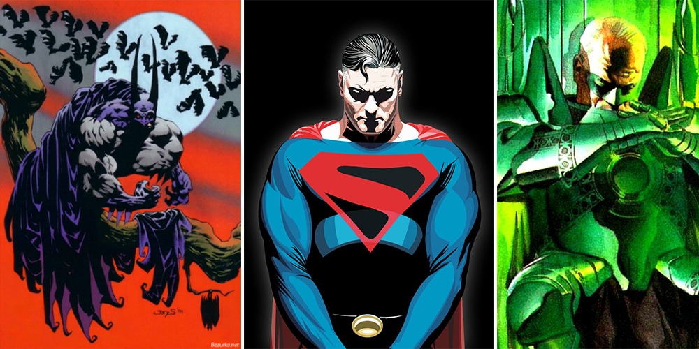
Better: Kingdom Come Superman
 3")
We all love this design so much and ultimately one thing has changed.
Nope, it’s not his hair. It’s the ominous black shade on his shield we’re talking about. This helps the “S” in red to stand out better while representing humanity and the world Superman is always trying to rise above.
Worse: Superboy
 4")
The Elseworlds design of Superboy may actually never the worst Superboy design till date.
This looks badly mixed with 90’s fashion and hair statement that you possibly can. Long hair? Yes. Big bandana? Yes. Jeans and leather jacket? YES! Well, not a really good taste for a superhero.
Best: Kingdom Come Green Lantern
 5")
If there’s a design better than Hal Jordan’s Green Lantern, we’d probably go with Kingdom Come version.
This is technically Alan Scott although a lot of it has been inspired by Hal Jordan’s appearance. An emerald armour and giant sword give the character a “green knight” which looks really cool.
Worse: Vampire Batman
 6")
The Elseworlds Vampire Batman stories are actually pretty cool, but this redesign was really bad.
Sometimes we get to see a Batman “with fangs” and Batman “with wings” which looks totally laughable. There’s also a “Batman before the wings come out” where he looks like a really “roused out Caped Crusader.”
Better: Kingdom Come Aquaman
 7")
Aquaman has also seen some good and some bad designs over the years. His original bright orange and green look actually look bad and this is probably why everyone enjoyed his Kingdom Come redesign so much.
He had a regal beard and wore royal robes. He looks like a royal-figure and this made the character look more noble, like the King of Atlantis.